
BASEMENT
R프로그래밍 4주차 본문

데이터의 이해 - 시각화
1. 시각화 개요
시각화 목적
- 자료의 내재된 정보를 효과적인 그림으로 표현하는게 목표
- 가공되지 않은 원천데이터로부터 정보를 추출하여 가시적으로 표현
2. 시각화 단계
1) 데이터 이해 : 데이터의 유형과 수집 기간, 그리고 데이터 내용 파악
2) 목표 설정 : 무엇을 알고 싶은지?
3) 그래프 선정 : 어떤 그래프가 좋을까?
4) 그래프 구현 : 핵심적인 의미를 담기 위한 옵션 선택과 그래프 구현
기본 그래프
1. 파이차트
파이 차트 옵션
ex) pie(x, label=names(x), angle=45, density=NULL, col=NULL, radius=1, clockwise=FALSE, init.angle=90)
-
x : 데이터 필드값 하나 ex) budget(예산)
-
labels : 각 파이의 이름
-
angle : 파이를 구성하는 각도
-
density : 파이를 구성하는 수 -> NULL 데이터에 맞추어짐
-
col : 파이의 색상
-
radius : 파이 원형의 크기
-
clockwise : 데이터가 시계방향으로 그려지는지 -> True = 시계방향 / False = 반시계방향
-
init.angle : 파이의 시작 각도. 0~90 까지만 가능
-
border : 외곽선의 색상
-
main : 표 제목
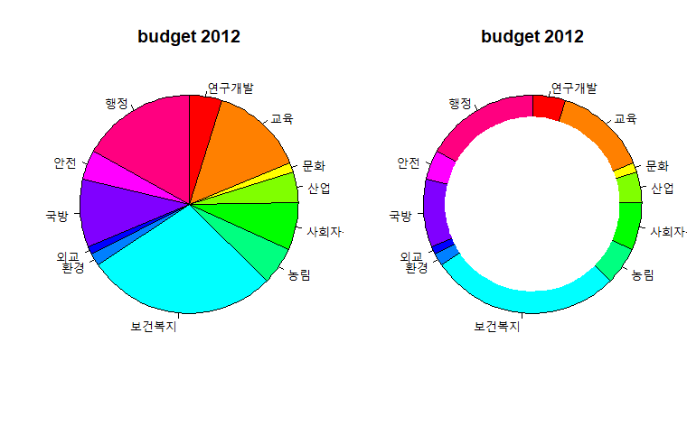
getwd()           # 현재 폴더 위치 확인해서 csv파일 넣어주기
budget2012 <- read.csv("budget2012.csv", header=T)       # csv파일 불러오기


par(mfrow=c(1,1))        # par(mforw=c(nr,nc)) : 그래프를 nr개의 행, nc개의 컬럼으로 배열한다
par(mar=c(1,1,1,1))	# 마진
pie(budget2012$budget, col=rainbow(12), labels=budget2012$name, radius=1, main="budget 2012", clockwise=T, init.angle=90)

windows(height=6, width=5.5)        # windows(height =  , widht =  ) : 윈도우 창 생성

par(new=T)                     # 기존 그래프 위에 덮기
par(mfrow=c(1,1))
pie(budget2012$budget, radius=0.8, col="white", labels=NA, border=NA)   # 도넛 차트 만들기

savePlot("piechart.png", type="png")         # 그래프를 png파일로 저장함
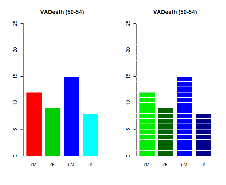
2. 막대 그래프 (bar plot)
여러 목적으로 아주 흔히 쓰이는 통계 그래프
어느 항목의 막대가 제일 긴지 보여줌
매체별 선호도, 재학생 연령별 분포 등
막대 그래프 옵션
- height : 각 기둥의 높이 # height, :막대 그래프의 높이를 저장한 값의 벡터 또는 행렬
- col : 색상
- border : 외각선 색상
- ylim : y축 범위
- round : 반올림
data(VADeaths)

windows(height=4,width=8)
par(mfrow=c(1,2))
colnames(VADeaths) <- c("rM", "rF", "uM", "uf")
barplot(round(VADeaths[1,]), col=2:5, border="white", ylim=c(0,25), main="VADeath (50-54)")

barplot(round(VADeaths[1,]), col=c("green2","darkgreen","blue","blue4"), border="white", ylim=c(0,25), main="VADeath (50-54)")

abline(h=1:25, col="white", lwd=2)   # abline : 막대그래프 가시화   # lwd :선 두께
savePlot("barplot.png", type="png")
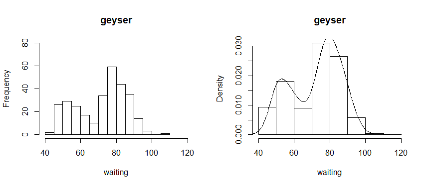
3. 히스토그램 (histogram)
연속형 데이터의 구간별 도수를 상대적인 막대의 길이로 나타낸 그래프
자료의 전체 분포도 파악하기 좋음
연속된 변수를 구간화 시켜서 범주형 변수와 같이 볼 수 있음
히스토그램 옵션
- nclass : 구간 수 # default 10개 -> 숫자가 커질수록 구간이 좁아짐
- xlab : x축 이름
- xlim : x축 범위
- ylim : y축 범위
library(MASS)
data(geyser)       # 온천데이터 - 변수 waiting, duration

windows(height=4, width=9); par(mfrow=c(1,2))
hist(geyser$waiting, nclass=20, main="geyser", xlab="waiting", xlim=c(40,120), ylim=c(0,80)) #대기시간 그래프
hist(geyser$duration, nclass=16, main="geyser", xlab="duration", xlim=c(0,8), ylim=c(0,80))  # 지속시간 그래프

hist(geyser$waiting, breaks=seq(40,120,by=10), main="geyser", xlab="waiting", probability = T)  # y축이 density로, 밀도 조절
hist(geyser$waiting, breaks=seq(40,120,by=10), main="geyser", xlab="waiting", freq = T)

lines(density(geyser$waiting))   # probability 작성 후 히스토그램에 선 추가

# cut(geyser$waiting, breaks=seq(40,120,by=10)) : 구간을 나눠줌
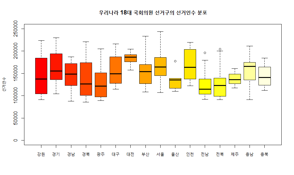
4. 상자그림 (Box plot)
사분위수와 중앙값으로 상자를 만들고 최대/최소에 선을 연결한 자료의 퍼짐 정도를 보고 분포를 파악함
상자의 중앙선은 중앙값(median), 상자의 위/아래 모서리는 3분위/1분위, 상자에 연결된 줄의 양끝은 최대/최소
동그라미는 이상치 -> 새로운 변수로 구간을 만들어서 고정
electorate <- read.csv("국회의원 선거구 유권자 수.csv", header=T)       # getwd() 폴더 안에 csv파일 넣어주기

str(electorate); attach(electorate)
windows(height=6, width=5)
boxplot(선거인.수, col="yellow", ylim=c(0,250000), xlab="전국", ylab="선거인수")

windows(height=6, width=10)
boxplot(선거인.수~시도, col=heat.colors(16), ylim=c(0,250000), ylab="선거인수", main="우리나라 18대 국회의원 선거구의 선거인수 분포")
savePlot("boxplot.png", type="png")
 # 선거인.수 ~ 시도 : y ~ x
 # col=heat.colors(16) : 따뜻한색 16개
5. 줄기 잎 그림 (Stem & Leaf plot)
수치로 된 자료를 줄기와 잎으로 분류하여 자료의 분포를 파악
같은 부분을 stem으로 , 나머지를 잎으로
scale=1이면 한줄, 2이면 두줄
data <- c(123,123,121,126,127,128,134, 136, 136, 136, 137,139,140,141,141,145,148,149,150,159,159)
stem(data, scale=1)
stem(data, scale=2)
이변량 그래프
1. 산점도 (Scatater plot)
이변량 연속형 자료를 2차원 평면에 넣은 그래프
가로와 세로의 비는 1:1
회귀적 관계
두 자료 비교가 쉬움
install.packages("KernSmooth")
library(MASS)
library(KernSmooth)
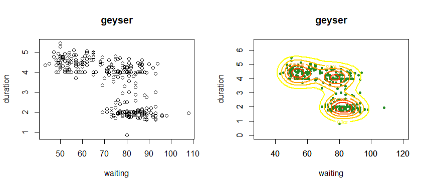
data(geyser)
windows(height=4, width=9); par(mfrow=c(1,2))
plot(geyser$waiting, geyser$duration, xlab="waiting", ylab="duration", main="geyser")
plot(geyser$waiting, geyser$duration, xlim=c(30,120), ylim=c(0,6.5), col="forestgreen", pch=20, xlab="waiting", ylab="duration", main="geyser")
# xlim = x축 범위 변화, ylim = y축 범위 변화
# pch = 그래픽 기호 (20 : 원형)
density <- bkde2D(geyser, bandwidth=c(5,0.5)) # bkde2D : 이변량 밀도함수를 구하는 함수 # density에 밀도함수를 담음
par(new=T)
contour(density$x1, density$x2, density$fhat, xlim=c(30,120), ylim=c(0,6.5), col=heat.colors(7)[7:1], nlevels=7, lwd=2) # 밀도함수로 구한 값을 등고선으로 그림
2. 회귀모형
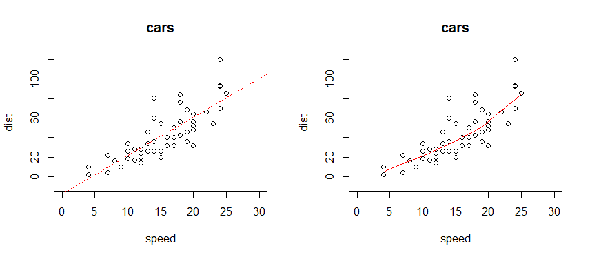
data(cars)

windows(height=4, width=9); par(mfrow=c(1,1))
plot(dist ~ speed, data=cars, main="cars", xlim=c(0,30), ylim=c(-10,120))
linear.reg <- lm(dist ~ speed, data=cars)
abline(linear.reg, col="red", lty="dotted")

plot(dist ~ speed, data=cars, main="cars", xlim=c(0,30), ylim=c(-10,120))
lowess.reg <- lowess(cars)         # 빨간선이 점의 위치에 비슷하게 일치하도록 조정됨
lines(lowess.reg, col="red")
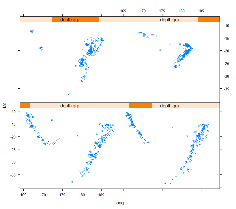
3. 조건부 플랏 (Conditioning plot)
제 3의 변수의 수준에 따라 병렬되는 일련의 통계 그래프
install.packages("lattice")   # lattice 함수 - xyplot : 산점도(scatter plot) /  bwplot : 박스플랏(box plot)
library(lattice)

data(quakes)   # 지진 데이터

depth.grp <- equal.count(quakes$depth, number=4, overlap=0)        # depth로 4개 비교
xyplot(lat~long|depth.grp, data=quakes)
유형별 그래프
사각타일, 모자이크 그림 - 분석에 잘 사용하지 않음
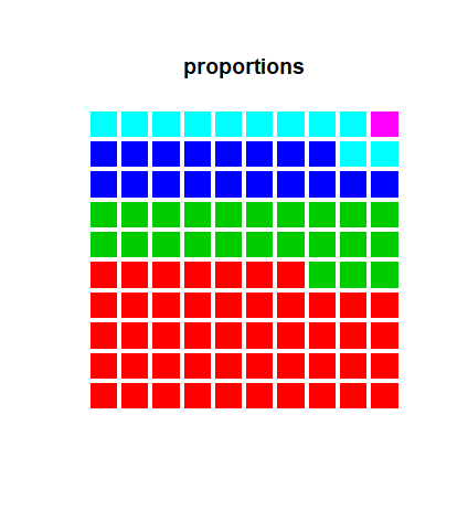
1. 사각 타일 (Square tiles)
사각형 틀에 배열한 100개의 색 타일로 시각화
특정 속성의 구성 비율을 시각화
prop <- c(47,23,18,11,1)
type <- "systematic"      # type <- "random"
m <- length(prop)
# square tiles
p.vec <- rep(1:m, prop)
if (type=="random") p.vec <- sample(p.vec)
p <- matrix(p.vec, 10, 10)
color <- 2:(m+1)

windows(height=5, width=4.5); par(oma=c(0,0,1,1))
image(p, col=color, axes=F, main="proportions")
abline(h=seq(-0.05,1.05,1.1/10), col="white", lwd=4)


abline(v=seq(-0.05,1.05,1.1/10), col="white", lwd=4)
savePlot("square titles_1.png", type="png")
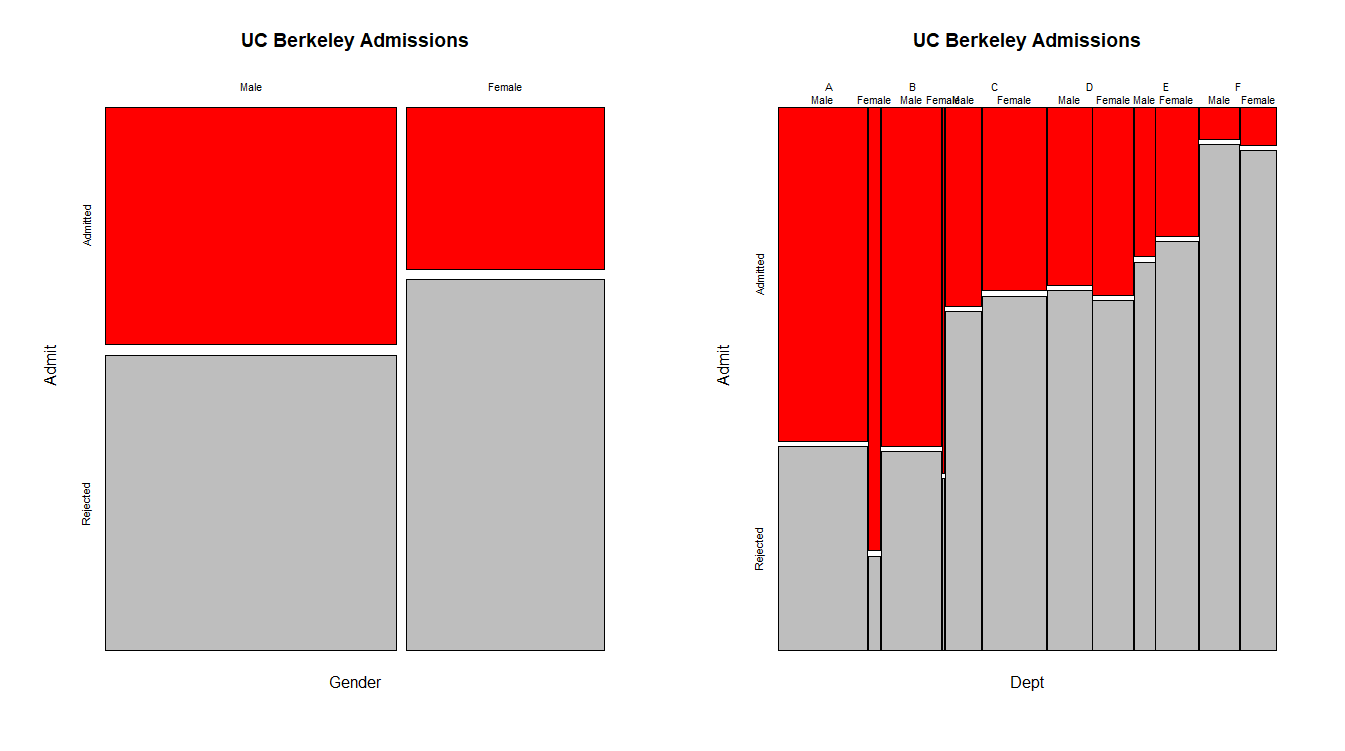
2. 모자이크 그림 (Mosaic plot)
2원 3원 교차표의 시각화
전체 정사각형 도형을 행 빈도에 비례하는 직사각 도형으로 나누고, 다시 각 도형을 행 내 열의 빈도에 해당하는 직사각 도형으로 나눔
data(UCBAdmissions)
str(UCBAdmissions)

require(graphics)          # library(graphics) 와 같음
windows(height = 4, width=8); par(mfrow=c(1,2))

mosaicplot(apply(UCBAdmissions, c(2,1), sum), color=c("red","grey"), main="UC Berkeley Admissions")
mosaicplot(~Dept+Gender+Admit, data=UCBAdmissions, color=c("red","grey"), dir=c("v","v","h"), off=1, main="UC Berkeley Admissions")
# ~Dept+Gender+Admit :

savePlot("berkeley_2.png", type="png")
ggplot2
데이터를 이해하는 데 좋은 시각화 툴
문법 내에서 간단한 코드 추가/삭제 가능
ggplot2 문법
- ggplot(...) + plot의 종류 (box plot, bar plot, scatter plot 등)
- geom : 점,선,면 존재
- stats : 통계옵션
- facets : 화면 분할
- aes
1) x: X축
2) y: Y축
3) color: 그래프의 색깔, 모양일 경우 테두리
4) fill: 채우는 색깔
5) size: 라인의 굵기 또는 점의 크기
6) alpha: 투명도
7) linetype: 선 패턴
8) labels: 표나 축의 텍스트
ggplot2 순서
1) 데이터 할당
2) 변수 할당
3) aes 설정
4) geom 형태 설정
install.packages("ggplot2")
install.packages("gcookbook")

require(ggplot2)
require(gcookbook)  #caggage_exp 데이터 사용

data(cabbage_exp)

ggplot(cabbage_exp, aes(x=Date, y=Weight, fill=Cultivar)) +  # 데이터
geom_bar(stat='identity', position='fill', colour='black') +     # 막대그래프
scale_fill_brewer(palette='Pastel1') +          #색깔 바꾸기
coord_flip()     # x축과 y축 뒤바꾸기
require(ggplot2)
require(gcookbook)

install.packages("carData")
library(carData)
data(Salaries)

p <- ggplot(aes(x=yrs.service, y=salary), data=Salaries)    # 변수할당, aes 설정
p+geom_blank()    # 빈 그래프 생성
p+geom_point()     # 점 그래프 생성
p+geom_point(aes(colour=sex)) + geom_smooth()     # 회귀선 추가.  범례 색상이 달라짐(남성, 여성)
p+geom_point(aes(colour=sex)) + geom_smooth() + facet_grid(~sex)    # 남성 여성 분리
ggplot(Salaries, aes(x=salary, y=..density..)) +
  geom_histogram(colour='grey60', fill='cornsilk') +
  geom_density(colour=NA, fill='blue', alpha=0.2) +
  geom_line(stat='density', colour='red') +
  xlim(45000,250000)
install.packages("ggthemes")
library(ggthemes)    # theme_few() 적용을 위해 (테마적용)

ggplot(Salaries, aes(x=yrs.since.phd, y=salary, fill=sex)) +     # 데이터 및 변수 할당
  geom_smooth(method=lm, formula = y~poly(x,2)) +          # 회귀선 추가
  geom_point(shape=21) +      # 점 그래프
  facet_grid(.~sex) +          # 새로운 면 분할
  theme_few() +           # 테마 적용
  scale_colour_few()            # 테마에 있는 배색 적용
data("mtcars")
str(mtcars)
summary(mtcars)

mtcars$cy1=factor(mtcars$cy1)

ggplot(mtcars, aes(x=disp, y=mpg, colour=cy1)) +
  geom_text(aes(label=rownames(mtcars), x=disp+5), hjust=0) +
  geom_point() + xlim(50,600)
cf) check_overlap = T -> 선점도에서 중복되는 레이블 삭제
library(MASS)
library(ggplot2)

data(geyser)
# x는 waiting, y는 duration
# 점 그래프

ggplot(geyser, aes(x=waiting, y=duration)) +
  geom_point(aes(color="red"))
# ggplot2 실습 - 다이아몬드 캐럿과 가격에 따른 선명도 그래프

library(ggplot2)
data("diamonds")

ggplot(data=diamonds, aes(x=carat, y=price)) +
  geom_point(aes(colour=clarity))         # clarity : 선명도


qplot(diamonds$carat, diamonds$price)
qplot(carat, price, data=diamonds)
qplot(carat, price, data=diamonds, geom="point", colour=clarity)         # qplot : geom을 안에 써줌

ggplot(data=diamonds, aes(x=price)) +
  geom_bar(binwidth=3000) +
  facet_grid( . ~ cut)                         # 분할 함수

ggplot(data=diamonds, aes(x=price)) +
  geom_bar(binwidth=3000) +
  facet_wrap( ~ cut, nrow=3)              # 분할 함수
# ggplot2 실습 - 시계열 데이터

library(reshape)
library(ggplot2)

conn <- read.table("conn.txt", header=T)
str(conn)      # 송유관 재질 3종
windows(height = 5.5, width=7)

plot(castiron ~ year, type="l", data=conn, ylab="m.miles", lwd=2, col="brown1")
text(2010, 100000, "cast iron", col="brown1")
par(new=T)
plot(steel ~ year, type="l", data=conn, lwd=2, ylab="m.miles", col="green3", ylim=c(0,1000000))
text(2010, 500000, "steel", col="green3")
par(new=T)
plot(plastic ~ year, type="l", data=conn, lwd=2, ylab="m.miles", col="blue", ylim=c(0,1000000))
text(2010, 720000, "plastic", col="blue")
title("Pipeline Materials by Year")

data <- reshape(conn, varying = c("castiron", "steel", "plastic"), v.names = "mmiles", timevar = "material", times = c("castiron", "steel", "plastic"), direction = "long")
data <- subset(data, select = -c(id))
head(data)

graph <- ggplot(data, aes(x=year, y=mmiles, fill=material)) +
  geom_area(position = 'stack') +           # 면적으로 된 그래프 형태
  labs(x="Year", y="Total Miles of Pipeline in Millions") +
  scale_fill_discrete(name = "Material", breaks = c("plastic", "steel", "castiron"), labels= c("plastic", "steel", "castiron"))  # breaks : 나눔 (cut과 같은 역할)
plot(graph)
# ggplot2 실습 - 미 주 지역의 범죄 사건

install.packages("maps")
install.packages("mapproj")

require(ggplot2)
require(maps)
require(mapproj)

data(USArrests)
crimes <- data.frame(state=tolower(rownames(USArrests)), USArrests)    # 소문자로 변환
states_map <- map_data("state")

head(states_map)

ggplot(crimes) +
  geom_map(aes(map_id=state, fill=Murder), map=states_map) +      # 미국 주 별 살인사건 그래프
  expand_limits(x=states_map$long, y=states_map$lat) +
  coord_map()

head(crimes)
library(reshape2)
crimesm <- melt(crimes, id.vars = "state")      # melt를 사용하여 state별 murder 값
head(crimesm)

# 변수 별 미주 지역의 사건발생 그래프
ggplot(crimesm) +
  geom_map(aes(map_id=state, fill=value), map=states_map, colour='grey50', size=0.1) +
  expand_limits(x=states_map$long, y=states_map$lat) +
  scale_fill_gradientn(colours = c("white", "green", "blue", "red")) +
  facet_wrap(~variable) +
  coord_map()
'Programming > R' 카테고리의 다른 글
| R 프로그래밍 - 7주차 (0) | 2020.08.11 |
|---|---|
| R 프로그래밍 6주차 (0) | 2020.07.20 |
| R 프로그래밍 5주차 (0) | 2020.07.18 |
| R프로그래밍 3주차 (0) | 2020.07.05 |
| R 프로그래밍 2주차 (0) | 2020.07.05 |


