
BASEMENT
Python 7주차 - 1 본문

파이썬 실습
1. 양의 정수를 1, 2, 4 의 세개의 수로만 표현하는 프로그램 작성
- 3으로 나눈 경우의 몫과 나머지 이용
- 나머지의 표현이 0 -> 4, 1 -> 1, 2 -> 2 로 표현
- 1부터 100까지의 수를 124의 수로 표현
def onetwofour(q):
    number = ''
    reminder = '412'
    while q:
        q,r = divmod(q,3)   # divmod() : 앞의 수를 뒤의 수로 나누었을 때 몫과 나머지를 반환해줌
        number = reminder[r] + number
        if not r:
            q -= 1
    return number

if __name__ == "__main__":
    end = int(input("enter last number>> "))
    for i in range(1,end+1):
        print(" : %d ==> 124   %s" % (i, onetwofour(i)))

# 결과
enter last number>> 7
 : 1 ==> 124   1
 : 2 ==> 124   2
 : 3 ==> 124   4
 : 4 ==> 124   11
 : 5 ==> 124   12
 : 6 ==> 124   14
 : 7 ==> 124   21
2. 문자열 중에서 가운데 문자를 출력하는 프로그램 작성
- 문자열의 길이가 짝수인 경우는 가운데 두 글자를 반환
- 문자열의 길이가 홀수인 경우는 가운데 한 글자를 반환
- 문자열의 길이는 1이상 50이하로 작성
def median_s(string):
    length = len(string)
    q = length//2
    if length%2 == 0:
        return string[q-1:q+1]
    else:
        return string[q]

if __name__ == "__main__":
    string = input("enter a string between 1 and 50 lengths >> ")
    print(median_s(string))

# 결과
enter a string between 1 and 50 lengths >> aabbcc
bb
3. 두 개의 주사위를 던졌을 때의 합계가 특정 수가 나오는 경우의 개수와 경로를 출력하는 프로그램 작성
ex)
enter special dice sum_num >> 5
[4, [[1,4], [2,3], [3,2], [4,1]]]
enter special dice sum_num >> 8
[5, [[2,6], [3,5], [4,4], [5,3], [6,2]]]
from collections import Counter, defaultdict

def find_dice_prob(s, n_faces=6):
    if s>2*n_faces or s<2:
        return None
    cdict= Counter()
    ddict= defaultdict(list)

    for dice1 in range(1, n_faces+1):
        for dice2 in range(1, n_faces+1):
            t = [dice1, dice2]
            cdict[dice1 + dice2] += 1
            ddict[dice1 + dice2].append(t)

    return [cdict[s], ddict[s]]

def test_find_prob(s):
    n_faces = 6
    s = s
    results = find_dice_prob(s, n_faces)
    print(results)

if __name__ == "__main__":
    s = int(input("enter special dice sum_num >> "))
    test_find_prob(s)
탐색적 데이터 분석
1. 탐색적 데이터 분석의 과정
1) 데이터
- raw data : 정제되지 않은 데이터
- 데이터의 출처와 주제에 대해 이해
- 데이터의 크기 알아보기
- 데이터의 구성요소(피처) 살펴보기
2) 데이터의 속성 탐색
데이터의 실제 내용 탐색 과정 - 피처의 속성 탐색, 피처 간의 상관 관계 탐색
2-1) 피처의 속성 탐색
피처의 측정 가능한 정량적 속성을 정의하는 것
데이터에 질문을 던지는 것
2-2) 피처 간의 상관 관계 탐색
여러 개의 피처가 서로에게 미치는 영향력을 알아보는 것
피처 간의 공분산, 혹은 상관 계수와 같은 개념 알아보기
3) 탐색한 데이터의 시각화
파악한 데이터를 시각화함. 수치적 자료로 파악하기 힘든 패턴이나 인사이트를 발견하는데 유용.
2. 데이터 분석 예제 - chipotle 레스토랑
토이 데이터인 chipotle 레스토랑 주문데이터를 활용한 분석
cf) 토이 데이터 : 분석에 용이한 형태로 만들어진 연습용 데이터
cf) *.tsv, *.csv 파일은 excel 프로그램에서 파일열기로 실행 ( 또는 notepad++ 등의 문서편집과 코드편집 프로그램 사용)
1) 파일 읽기 코드
#-*- coding:utf-8 -*-	# 인코딩

import pandas as pd

file_path = "./analysis/data/chipotle.tsv"
chipo = pd.read_csv(file_path, sep='\t')	# tsv 파일이므로 \t로 구분해줌
print(chipo.shape)
print('='*40)
print(chipo.info())

# 결과
(4622, 5)
========================================
<class 'pandas.core.frame.DataFrame'>
RangeIndex: 4622 entries, 0 to 4621
Data columns (total 5 columns):
 #   Column              Non-Null Count  Dtype
---  ------              --------------  -----
 0   order_id            4622 non-null   int64
 1   quantity            4622 non-null   int64
 2   item_name           4622 non-null   object
 3   choice_description  3376 non-null   object
 4   item_price          4622 non-null   object
dtypes: int64(2), object(3)
memory usage: 180.7+ KB
None
2) 피처 형태의 종류
2-1) 수치형
- 연속형 : 어떤 구간 안의 모든 값을 데이터로써 가질 수 있음 ex) 키, 몸무게
- 비연속형 : 셀 수 있으며, 일정 구간 안에서 정해진 몇 개의 값을 가짐 ex) 나이
2-2) 범주형
- 순서 있는 범주형 : 순서가 있으나 수치는 아님 ex) 학점
- 순서 없는 범주형 : 데이터가 구분되면서 순서가 없음 ex) 혈액형, 성별
3) 기초 통계량 분석전 데이터 전처리
- 기초 통계 분석은 수치형 피처만 가능
- 주문번호는 수치적 의미를 가지는 데이터가 아니므로 문자열로 처리
- 음식가격은 가격 앞의 $를 처리 후 수치형으로 처리
4) 데이터에 포함된 특수 문자 제거 시 apply 함수 사용
apply()
- DataFrame, Series 타입의 객체에 적용
- 행 또는 열 또는 전체의 원소에 원하는 연산을 적
- sum(), mean() 등의 연산이 정의된 함수를 인자로 사용
- pandas에서 사용자 정의 함수를 이용해서 분석할 때 주로 이용함
cf) np.mean() : 산술평균 / np.average() : mean과 같으나 가중평균을 구할 수 있음
data = np.arange(1,6)
weight = np.arange(0.5,0,-0.1)	# 가중치 부여
print(np.average(data))
print(np.average(data,weights=weight))

# 결과
3.0
2.333333333333333
apply 예제
import pandas as pd
import numpy as np
import math

df = pd.DataFrame({'국어':[90,88,92], '수학':[87,90,95], '영어':[94,86,89]}, index=['고길동','김둘리','이하늬'])
def score(df):
    return math.ceil((df['수학']+df['영어']+df['국어'])/3)

print(df.head())
df.apply(lambda x:x+5)  # 모든 점수에 +5
df.apply(np.mean, axis=0)  # 과목별 평균을 구하는 경우
df.apply(np.average, axis=1) # 학생별 평균을 구하는 경우
df['평균'] = df.apply(score, axis=1) # 사용자 정의 함수 이용, 각 학생들의 두 과목 평균 구하는 경우
cf) apply 외 map 함수 사용
Pandas는 판다스 자료형(DataFrame, Series) 내의 함수 사용
Pandas에서 제공하지 않는 기능, 즉 사용자 정의 함수를 적용할 때 사용하는 함수가 apply, map
map 함수 : Series(value+indeX) 타입에서만 사용 가능 ex) s = df['국어'].map(np.mean)
apply 함수 : DataFrame, Series 사용 가능
5) chipotle의 데이터 전처리 코드
주문번호(oreder_id)와 품목가격(item_price)의 전처리
chipo['order_id'] = chipo['order_id'].astype(str)
chipo['item_price'] = chipo['item_price'].apply(lambda x:float(x[1:]))
print(chipo.info())
chipo.describe()    # describe() : 기초 통계량 (count,mean,std,min,4분위수,max)

# 결과
<class 'pandas.core.frame.DataFrame'>
RangeIndex: 4622 entries, 0 to 4621
Data columns (total 5 columns):
 #   Column              Non-Null Count  Dtype
---  ------              --------------  -----
 0   order_id            4622 non-null   object
 1   quantity            4622 non-null   int64
 2   item_name           4622 non-null   object
 3   choice_description  3376 non-null   object
 4   item_price          4622 non-null   float64	# float로 변환
dtypes: float64(1), int64(1), object(3)
memory usage: 180.7+ KB
None
6) 가장 많이 주문한 Top 10 출력
item_count = chipo['item_name'].value_counts()[:10]
for idx, (val, cnt) in enumerate(item_count.iteritems(),1):
    print("Top", idx, ":", val, cnt)

# 결과
Top 1 : Chicken Bowl 726
Top 2 : Chicken Burrito 553
Top 3 : Chips and Guacamole 479
Top 4 : Steak Burrito 368
Top 5 : Canned Soft Drink 301
Top 6 : Chips 211
Top 7 : Steak Bowl 211
Top 8 : Bottled Water 162
Top 9 : Chicken Soft Tacos 115
Top 10 : Chicken Salad Bowl 110
7) 아이템별 주문 개수와 총량 - groupby() 사용
# 아이템별 주문 개수
order_count = chipo.groupby('item_name')['order_id'].count()
print(order_count[:10])

# 결과
item_name
6 Pack Soft Drink         54
Barbacoa Bowl             66
Barbacoa Burrito          91
Barbacoa Crispy Tacos     11
Barbacoa Salad Bowl       10
Barbacoa Soft Tacos       25
Bottled Water            162
Bowl                       2
Burrito                    6
Canned Soda              104
Name: order_id, dtype: int64

# 아이템별 주문 총량
item_quantity = chipo.groupby('item_name')['quantity'].sum()
print(item_quantity[:10])

# 결과
item_name
6 Pack Soft Drink         55
Barbacoa Bowl             66
Barbacoa Burrito          91
Barbacoa Crispy Tacos     12
Barbacoa Salad Bowl       10
Barbacoa Soft Tacos       25
Bottled Water            211
Bowl                       4
Burrito                    6
Canned Soda              126
Name: quantity, dtype: int64
8) 시각화
item_name_list = item_quantity.index.tolist()
x_pos = np.arange(len(item_name_list))
order_cnt = item_quantity.values.tolist()	# tolist() : 앞의 자료형을 list로 변환

plt.bar(x_pos, order_cnt, align='center')
plt.ylabel('ordered_item_count')
plt.title('Distribution of all orderd item')

plt.show()
9) 주문당 평균 계산금액 출력
chipo.groupby('order_id')['item_price'].sum().mean()

# 결과
18.811428571428568
10) 한 주문에 10달러 이상 지불한 주문번호(id) 출력
chipo_orderid_group = chipo.groupby('order_id').sum()
results = chipo_orderid_group[chipo_orderid_group.item_price >= 10]
print(results[:10])	# 한 주문이 10달러 이상인 데이터 10개 출력
print(results.index.values)	# id 출력

# 결과
          quantity  item_price
order_id
1                4       11.56
10               2       13.20
100              2       10.08
1000             2       20.50
1001             2       10.08
1002             2       10.68
1003             2       13.00
1004             2       21.96
1005             3       12.15
1006             8       71.40
['1' '10' '100' ... '997' '998' '999']
11-1) 각 아이템의 가격 유추하여 구하기
- 1. chipo[chipo.quantity == 1]으로 동일 아이템을 1개만 구매한 주문 선별
- 2. item_name을 기준으로 groupby 수행, min() 함수로 각 그룹별 최저가 계산
- 3. item_price를 기준으로 정렬하는 sort_values() 함수 적용. sort_values는 Series 데이터를 정렬해주는 함수
chipo_one_item = chipo[chipo.quantity == 1]
price_per_item = chipo_one_item.groupby('item_name').min()
price_per_item.sort_values(by = "item_price", ascending = False)[:10]
11-2) 각 아이템의 가격 분포 그래프
item_name_list = price_per_item.index.tolist()
x_pos = np.arange(len(item_name_list))
item_price = price_per_item['item_price'].tolist()

plt.bar(x_pos, item_price, align='center')
plt.ylabel('item price($)')
plt.title('Distribution of item price')
plt.show()

# 히스토그램으로 그리기
plt.hist(item_price)
plt.ylabel('counts')
plt.title('Histogram of item price')
plt.show()

cf) describe() : 기초통계량 출력 (count, mean, std, min, 4분위수, max)
cf) Pandas의 함수들
- unique : Series에만 적용, 중복성이 제거된 유일한 값들만 반환
- value_counts : Series에만 적용, 객체가 가장 많은 순서대로 객체와 객체의 수를 반환
import pandas as pd

items = pd.Series([1,4,10,5,9,10,4,10,5])
print(items.unique())
print(items.value_counts())

# 결과
[ 1  4 10  5  9]
10    3
5     2
4     2
9     1
1     1
12) 가장 비싼 주문에서 아이템이 총 몇 개 팔렸는지 구하기
chipo.groupby('order_id').sum().sort_values(by='item_price', ascending=False)[:5]

# 결과
	quantity	item_price
order_id
926	23	205.25
1443	35	160.74
1483	14	139.00
691	11	118.25
1786	20	114.30
13) 'Veggie Salad Bowl'이 몇 번 주문되었는지 구하기
# 'Veggie Salad Bowl'이 몇 번 주문되었는지 계산
chipo_salad = chipo[chipo['item_name'] == "Veggie Salad Bowl"]
# 한 주문 내에서 중복 집계된 item_name 제거
chipo_salad = chipo_salad.drop_duplicates(['item_name', 'order_id'])

print(len(chipo_salad))
chipo_salad.head(5)

# 결과
18
order_id	quantity	item_name	choice_description	item_price
186	83	1	Veggie Salad Bowl	[Fresh Tomato Salsa, [Fajita Vegetables, Rice,...	11.25
295	128	1	Veggie Salad Bowl	[Fresh Tomato Salsa, [Fajita Vegetables, Lettu...	11.25
455	195	1	Veggie Salad Bowl	[Fresh Tomato Salsa, [Fajita Vegetables, Rice,...	11.25
496	207	1	Veggie Salad Bowl	[Fresh Tomato Salsa, [Rice, Lettuce, Guacamole...	11.25
960	394	1	Veggie Salad Bowl	[Fresh Tomato Salsa, [Fajita Vegetables, Lettu...	8.75
14) 'Chicken Bowl'을 2개 이상 주문한 주문 횟수 구하기
chipo_chicken = chipo[chipo['item_name'] == "Chicken Bowl"]
chipo_chicken_ordersum = chipo_chicken.groupby('order_id').sum()['quantity']
chipo_chicken_result = chipo_chicken_ordersum[chipo_chicken_ordersum >= 2]

print(len(chipo_chicken_result))
chipo_chicken_result.head(5)

# 결과
114
order_id
1004    2
1023    2
1072    2
1078    2
1091    2
3. 데이터 분석 예제 - 국가별 음주 데이터 분석
1) 국가별 음주 데이터 분석
- 각각의 피처간의 상관 관계 파악 - 모든 역속형 피처의 상관 분석
- 평균 맥주 소비량이 가장 높은 대륙 - 모든 행을 그룹 단위로 분석
- 술 소비량 대비 알코올 비율 피처 생성 - 새로운 분석 피처 생성
- 아프리카와 유럽 간의 맥주 소비량 차이의 검정 - 통계적 차이 검정
2) 음주 데이터의 기본 정보
import pandas as pd
import numpy as np
import matplotlib.pyplot as plt

file_path = 'drinks.csv'
drinks = pd.read_csv(file_path)
print(drinks.info())
drinks.head(10)
drinks.describe()   # 기본 통계 정보

# 결과
<class 'pandas.core.frame.DataFrame'>
RangeIndex: 193 entries, 0 to 192
Data columns (total 6 columns):
 #   Column                        Non-Null Count  Dtype
---  ------                        --------------  -----
 0   country                       193 non-null    object
 1   beer_servings                 193 non-null    int64
 2   spirit_servings               193 non-null    int64
 3   wine_servings                 193 non-null    int64
 4   total_litres_of_pure_alcohol  193 non-null    float64
 5   continent                     170 non-null    object
dtypes: float64(1), int64(3), object(2)
memory usage: 9.2+ KB
None

beer_servings	spirit_servings	wine_servings	total_litres_of_pure_alcohol
count	193.000000	193.000000	193.000000	193.000000
mean	106.160622	80.994819	49.450777	4.717098
std	101.143103	88.284312	79.697598	3.773298
min	0.000000	0.000000	0.000000	0.000000
25%	20.000000	4.000000	1.000000	1.300000
50%	76.000000	56.000000	8.000000	4.200000
75%	188.000000	128.000000	59.000000	7.200000
max	376.000000	438.000000	370.000000	14.400000
3) 각 피처의 상관관계 파악 - pearson 상관계수 사용
corr = drinks[['beer_servings', 'wine_servings']].corr(method='pearson')
print(corr)

# 결과
               beer_servings  wine_servings
beer_servings       1.000000       0.527172
wine_servings       0.527172       1.000000
4) 여러 피처의 상관 관계 분석하기
cols = ['beer_servings', 'spirit_servings', 'wine_servings', 'total_litres_of_pure_alcohol']
corr = drinks[cols].corr(method='pearson')
print(corr)

# 결과
beer_servings  spirit_servings  wine_servings  \
beer_servings                      1.000000         0.458819       0.527172
spirit_servings                    0.458819         1.000000       0.194797
wine_servings                      0.527172         0.194797       1.000000
total_litres_of_pure_alcohol       0.835839         0.654968       0.667598

                              total_litres_of_pure_alcohol
beer_servings                                     0.835839
spirit_servings                                   0.654968
wine_servings                                     0.667598
total_litres_of_pure_alcohol                      1.000000
5) seaborn 라이브러리 사용, heatmap 그리기
import seaborn as sns
import matplotlib.pyplot as plt

cols_view = ['beer', 'spirit', 'wine', 'alcohol']
sns.set(font_scale=1.5)
hm = sns.heatmap(corr.values,
                 cbar = True,
                 annot = True,
                 square = True,
                 fmt = '.2f',
                 annot_kws = {'size':15},
                 yticklabels = cols_view,
                 xticklabels = cols_view)
plt.tight_layout()
plt.show()
6) 피처 간의 산점도 그래프 출력
sns.set(style = 'whitegrid', context='notebook')
sns.pairplot(drinks[['beer_servings', 'spirit_servings', 'wine_servings', 'total_litres_of_pure_alcohol']], height=2.5)
plt.show()
7. 결측 데이터 전처리 - 기타 대륙으로 통합 (OT)
drinks['continent'] = drinks['continent'].fillna('OT')
drinks.head(10)
8. 파이차트로 시각화
labels = drinks['continent'].value_counts().index.tolist()
fracs1 = drinks['continent'].value_counts().values.tolist()
explode = (0,0,0,0.25,0,0)

plt.pie(fracs1, explode=explode, labels=labels, autopct='%.0f%%', shadow=True)
plt.title('null data to \'OT\'')
plt.show()
9. agg() 함수를 이용해 대륙별로 분석하기 - 대륙별 spirit_servings의 평균, 최소, 최대, 합계 계산
result = drinks.groupby('continent').spirit_servings.agg(['mean','min','max','sum'])
result.head()

# 결과
    mean	min	max	sum continent
AF	16.339623	0	152	866
AS	60.840909	0	326	2677
EU	132.555556	0	373	5965
OC	58.437500	0	254	935
OT	165.739130	68	438	3812
10. 전체 평균보다 많은 알코올을 섭취하는 대륙 구하기
total_mean = drinks.total_litres_of_pure_alcohol.mean()
continent_mean = drinks.groupby('continent')['total_litres_of_pure_alcohol'].mean()
continent_over_mean = continent_mean[continent_mean >= total_mean]
print(continent_over_mean)

# 결과
continent
EU    8.617778
OT    5.995652
SA    6.308333
Name: total_litres_of_pure_alcohol, dtype: float64
11. 평균 berr_servings가 가장 높은 대륙 구하기
- idxmax() 함수 : Series 객체에서 값이 가장 큰 index 반환
beer_continent = drinks.groupby('continent').beer_servings.mean().idxmax()
print(beer_continent)

# 결과
EU
12. 대륙별 spirit_servings의 평균,최소,최대,합계 시각화
n_groups = len(result.index)
means = result['mean'].tolist()
mins = result['min'].tolist()
maxs = result['max'].tolist()
sums = result['sum'].tolist()

index = np.arange(n_groups)
bar_width = 0.1

rects1 = plt.bar(index, means, bar_width, color='r', label='Mean')
rects2 = plt.bar(index+bar_width, bar_width, color='g', label='Min')
rects3 = plt.bar(index+bar_width*2, maxs, bar_width, color='b', label='Max')
rects3 = plt.bar(index+bar_width*3, sums, bar_width, color='y', label='Sum')

plt.xticks(index, result.index.tolist())
plt.legend()
plt.show()
13. 대륙별 total_litres_of_pure_alcohol 시각화
continents = continent_mean.index.tolist()
continents.append('mean')
x_pos = np.arange(len(continents))
alcohol = continent_mean.tolist()
alcohol.append(total_mean)

bar_list = plt.bar(x_pos, alcohol, align='center', alpha=0.5)
bar_list[len(continents)-1].set_color('r')
plt.plot([0.,6], [total_mean, total_mean], "k--")
plt.xticks(x_pos, continents)

plt.ylabel('total_litres_of_pure_alcohol')
plt.title('total_litres_of_pure_alcohol by Continent')

plt.show()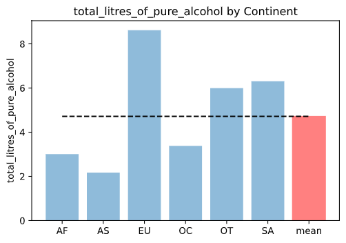
14. 대륙별 beer_servings 시각화
beer_group = drinks.groupby('continent')['beer_servings'].sum()
continents = beer_group.index.tolist()
y_pos = np.arange(len(continents))
alcohol = beer_group.tolist()

bar_list = plt.bar(y_pos, alcohol, align='center', alpha=0.5)
bar_list[continents.index("EU")].set_color('r')
plt.xticks(y_pos, continents)
plt.ylabel('beer_servings')
plt.title('beer_servings by Continent')

plt.show()
15. t-test
아프리카와 유럽 간의 맥주 소비량 차이를 검정
africa = drinks.loc[drinks['continent']=='AF']
europe = drinks.loc[drinks['continent']=='EU']

from scipy import stats

tTestResult = stats.ttest_ind(africa['beer_servings'], europe['beer_servings'])
tTestResultDiffVar = stats.ttest_ind(africa['beer_servings'], europe['beer_servings'], equal_var=False)
print("The t-statistic and p-value assuming equal variances is %.3f and %.3f" % tTestResult)
print("The t-statistic and p-value not assuming equal variances is %.3f and %.3f" % tTestResultDiffVar)

# 결과
The t-statistic and p-value assuming equal variances is -7.268 and 0.000
The t-statistic and p-value not assuming equal variances is -7.144 and 0.000
16. '대한민국은 얼마나 술을 독하게 마시는 나라일까?' 에 대한 탐색 코드
# total_servings 피처 생성
drinks['total_servings'] = drinks['beer_servings'] + drinks['wine_servings'] + drinks['spirit_servings']
# 술 소비량 대비 알코올 비율 피처 생성
drinks['alcohol_rate'] = drinks['total_litres_of_pure_alcohol'] / drinks['total_servings']
drinks['alcohol_rate'] = drinks['alcohol_rate'].fillna(0)
# 순위 정보 생성
country_with_rank = drinks[['country', 'alcohol_rate']]
country_with_rank = country_with_rank.sort_values(by=['alcohol_rate'], ascending=0)
country_with_rank.head(5)

# 결과
	country	alcohol_rate
63	Gambia	0.266667
153	Sierra Leone	0.223333
124	Nigeria	0.185714
179	Uganda	0.153704
142	Rwanda	0.151111
17. 국가별 순위 정보 시각화
country_list = country_with_rank.country.tolist()
x_pos = np.arange(len(country_list))
rank = country_with_rank.alcohol_rate.tolist()

bar_list = plt.bar(x_pos, rank)
bar_list[country_list.index("South Korea")].set_color('r')
plt.ylabel('alcohol rate')
plt.title('liquor drink rank by contry')
plt.axis([0,200,0,0.3])

korea_rank = country_list.index("South Korea")
korea_alc_rate = country_with_rank[country_with_rank['country'] == 'South Korea']['alcohol_rate'].values[0]
plt.annotate('South Korea: ' + str(korea_rank-1),
        xy=(korea_rank, korea_alc_rate),
        xytext=(korea_rank+10, korea_alc_rate+0.05),
        arrowprops=dict(facecolor='red', shrink=0.05))
plt.show()
4. 막대 도표
1) python을 이용하여 막대도표 생성
matplotlib 이용
초등학교 학년 별 인원수를 막대그래프로 작성
import pandas as pd
import matplotlib.pyplot as plt
import platform
from matplotlib import font_manager, rc


# matplotlib은 한글을 지원하지 않음 -> 폰트 변경 코드 필요
plt.rcParams['axes.unicode_minus'] = False
if platform.system() == 'Darwin':
    rc('font', family='AppleGothic')
elif platform.system() == 'Windows':
    path = 'c:/Windows/Fonts/malgun.ttf'
    font_name = font_manager.FontProperties(fname=path).get_name()
    rc('font', family=font_name)
else:
    print('Unknown System.....')


data = {'1학년':120, '2학년':99, '3학년':110, '4학년':130, '5학년':86, '6학년':107,}
d = pd.Series(data)
x_ = d.values
y_ = d.index

rects = plt.bar(y_, x_, color='blue', label='number')
plt.legend()
plt.show()
2) 누적막대 - bottom 속성 이용
data = {'1학년':[120,70,50], '2학년':[99,50,49], '3학년':[110,50,60], '4학년':[130,65,65], '5학년':[86,40,46], '6학년':[107,52,55]}
d = pd.DataFrame(data, index=['전체인원', '여학생수', '남학생수'])
x1_ = d.loc['전체인원'];x_f = d.loc['여학생수'];x_m = d.loc['남학생수']
y_ = d.columns

plt.bar(y_, x_f, color='b', bottom=x_m, label='여학생')
plt.bar(y_, x_m, color='purple', label='남학생')
plt.legend()
plt.show()
5. 파이도표
plt.pie 이용
slices, activities, cols의 데이터 필요
- slices : 파이차트를 차지하는 면적에 해당되는 값
- labels : 각 slices에 해당되는 이름(index)
- colors : 각 비율을 구분해주는 색상
- explode : 특정 값을 파이차트에서 분리시켜 보여줌
- actopct : 비율을 표시
data = {'1학년':120, '2학년':99, '3학년':110, '4학년':130, '5학년':86, '6학년':107,}
d = pd.Series(data)
x_ = d.values
y_ = d.index
color = ['r','g','b','y','m','purple']
pie1 = plt.pie(x_, labels=y_, colors=color, explode=(0,0,0.2,0,0,0), autopct="%1.1f%%")
plt.show()
6. boxplot
plt.boxplot
import pandas as pd
import numpy as np
import matplotlib.pyplot as plt

data = pd.Series([0,0,5,7,8,9,12,14,22,23])
plt.figure(figsize=(7,6))
boxplot = plt.boxplot([data.values], labels=['num'])
plt.yticks(np.arange(0,30,step=5))
plt.show()
7. 상관계수
1) 상관계수 구하는 법
- numpy : np.corrcoef()
- pandas : .corr(method='상관계수 종류')
- scipy : from scipy.stats import pearsonr / from scipy.stats import spearmanr
2) scipy를 사용하여 상관계수 구하기
from numpy.random import randn
from scipy.stats import pearsonr
from scipy.stats import spearmanr

# prepare data
data1 = 20*randn(1000) + 100
data2 = data1 + (10*randn(1000) + 50)

# calculate Pearson's correlation
corr1,_ = pearsonr(data1, data2)
print('Pearsons correlation: %.3f' % corr1)

# calculate spearman's correlation
corr2,_ = spearmanr(data1, data2)
print('Spearmans correlation: %.3f' % corr2)

plt.scatter(data1, data2)
plt.show()

# 결과
Pearsons correlation: 0.894
Spearmans correlation: 0.883
'Programming > Python' 카테고리의 다른 글
| Python 8주차 - 1 (0) | 2020.08.05 |
|---|---|
| Python 7주차 - 2 (0) | 2020.08.03 |
| Python 6주차 - 2 (0) | 2020.07.26 |
| Python 6주차 - 1 (0) | 2020.07.26 |
| Python 5주차 (0) | 2020.07.26 |


